CSS3 选择器(Selector)
|
|
如上所示,我们列举了一些 CSS3 的选择器,在我们日常的开发中可能会经常用到,这些新的 CSS3 特性解决了很多我们之前需要用 JavaScript 脚本才能解决的问题。
tbody: nth-child(even), nth-child(odd):此处他们分别代表了表格(tbody)下面的偶数行和奇数行(tr),这种样式非常适用于表格,让人能非常清楚的看到表格的行与行之间的差别,让用户易于浏览。
: not(.textinput):这里即表示所有 class 不是“textinput”的节点。
div:first-child:这里表示所有 div 节点下面的第一个直接子节点。
除此之外,还有很多新添加的选择器
@Font-face 特性
|
|
上边代码声明的两个服务端字体,其字体源指向“BORDERW0.eot”和“RUNICMT0.eot”文件,并分别冠以“BorderWeb”和“Runic”的字体名称。声明之后,我们就可以在页面中使用了:“ FONT-FAMILY: “BorderWeb” ” 和 “ FONT-FAMILY: “Runic” ”。
这种做法使得我们在开发中如果需要使用一些特殊字体,而又不确定客户端是否已安装时,便可以使用这种方式。
Word-wrap & Text-overflow 样式
“word-wrap: break-word”,设置或检索当当前行超过指定容器的边界时是否断开转行
“text-overflow” 则设置或检索当当前行超过指定容器的边界时如何显示(显示省略号)
边框和颜色(color, border)
颜色的透明度
|
|
这里的“rgba”属性中的“a”代表透明度,也就是这里的“0.75”.
圆角案例
|
|
CSS3 的渐变效果(Gradient)
线性渐变
左上(0% 0%)到右上(0% 100%)即从左到右水平渐变:
这里 linear 表示线性渐变,从左到右,由蓝色(#2A8BBE)到红色(#FE280E)的渐变。
还有复杂一点的渐变,如:水平渐变,33% 处为绿色,66% 处为橙色:
径向渐变
接下来我们要介绍径向渐变(radial),这不是从一个点到一个点的渐变,而从一个圆到一个圆的渐变。不是放射渐变而是径向渐变。来看一个例子
CSS3 的阴影(Shadow)和反射(Reflect)效果
首先来说说阴影效果,阴影效果既可用于普通元素,也可用于文字,参考如下代码:
设置很简单,对于文字阴影:表示 X 轴方向阴影向右 5px,Y 轴方向阴影向下 2px, 而阴影模糊半径 6px,颜色为 rgba(64, 64, 64, 0.5)。其中偏移量可以为负值,负值则反方向。元素阴影也类似。
接下来我们再来谈谈反射,他看起来像水中的倒影,其设置也很简单,参考如下代码:
CSS3 的背景效果
CSS3 多出了几种关于背景(background)的属性,我们这里会简单介绍一下:
首先:“Background Clip”,该属确定背景画区,有以下几种可能的属性:
- background-clip: border-box; 背景从 border 开始显示 ;
- background-clip: padding-box; 背景从 padding 开始显示 ;
- background-clip: content-box; 背景显 content 区域开始显示 ;
- background-clip: no-clip; 默认属性,等同于 border-box;
通常情况,我们的背景都是覆盖整个元素的,现在 CSS3 让您可以设置是否一定要这样做。这里您可以设定背景颜色或图片的覆盖范围。
其次:“Background Origin”,用于确定背景的位置,它通常与 background-position 联合使用,您可以从 border、padding、content 来计算 background-position(就像 background-clip)。
- background-origin: border-box; 从 border. 开始计算 background-position;
- background-origin: padding-box; 从 padding. 开始计算 background-position;
- background-origin: content-box; 从 content. 开始计算 background-position;
还有,“Background Size”,常用来调整背景图片的大小,注意别和 clip 弄混,这个主要用于设定图片本身。有以下可能的属性:
- background-size: contain; 缩小图片以适合元素(维持像素长宽比)
- background-size: cover; 扩展元素以填补元素(维持像素长宽比)
- background-size: 100px 100px; 缩小图片至指定的大小 .
- background-size: 50% 100%; 缩小图片至指定的大小,百分比是相对包 含元素的尺寸 .
最后,“Background Break”属性,CSS3 中,元素可以被分成几个独立的盒子(如使内联元素 span 跨越多行),background-break 属性用来控制背景怎样在这些不同的盒子中显示。
- background-break: continuous; 默认值。忽略盒之间的距离(也就是像元 素没有分成多个盒子,依然是一个整体一 样)
- background-break: bounding-box; 把盒之间的距离计算在内;
- background-break: each-box; 为每个盒子单独重绘背景。
这种属性让您可以设定复杂元素的背景属性。
最为重要的一点,CSS3 中支持多背景图片,参考如下代码:
此为同一元素两个背景的案例,其中一个重复显示,一个不重复。参考一下效果图:
CSS3 的盒子模型
参考文章:
弹性布局(Flex布局)
CSS3 的 Transitions, Transforms 和 Animation
Transitions
先说说 Transition,Transition 有下面些具体属性:
transition-property:用于指定过渡的性质,比如 transition-property:backgrond 就是指 backgound 参与这个过渡
transition-duration:用于指定这个过渡的持续时间
transition-delay:用于制定延迟过渡的时间
transition-timing-function:用于指定过渡类型,有 ease | linear | ease-in | ease-out | ease-in-out | cubic-bezier
可能您觉得摸不着头脑,其实很简单,我们用一个例子说明,参看一下如下代码:
这里他说明的是,这里 id 为“transDiv”的 div,当它的初始“background-color”属性变化时(被 JavaScript 修改),会呈现出一种变化效果,持续时间为 0.3 秒,效果为均匀变换(linear)。如:该 div 的 class 属性由“transStart”改为“transEnd”,其背景会由白(white)渐变到红(red)。
Transform
再来看看 Transform,其实就是指拉伸,压缩,旋转,偏移等等一些图形学里面的基本变换。见如下代码:
“skew”是倾斜,“scale”是缩放,“rotate”是旋转,“translate”是平移。最后需要说明一点,transform 支持综合变换。可见其效果图如下: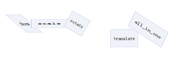
Animation
最后,我们来说说 Animation 吧。它可以说开辟了 CSS 的新纪元,让 CSS 脱离了“静止”这一约定俗成的前提。以 webkit 为例,见如下代码: